
http://www.archiact.com/content/6th-gates-shines-no-more


Concentrating on the latter, and taking up Elden’s notion of Foucault’s use of space as a tool of analysis, I explore how Foucault’s intense study of modern literature, particularly Roussel and Blanchot, contributes to underlying modes of spatialisation that drive his study of the history of clinical medicine, as well as the complex explanation of his archaeological approach.
Following Deleuze, I argue that these spatialisations are both the instrument and the object of his studies. They generate devices and tactics for dismantling established methods of analysis and manifest the powerful, multiple effects of discourse, whilst remaining meticulously at the level of description. Restricted material:

or the last ‘episode’ of this series of articles around the work of Michel Foucault, I would like to evoke the second favorite Foucauldian concept (the first one being the panopticon) that architects like to use, the heterotopia. As a matter of fact, this term, dropped in the architectural discourse became almost an argument in itself like an incantation – and I plead guilty about that myself for having used it often without any real meaningful deepening. The responsibility for that can only be half devolved to architects as this concept has been only loosely defined by Foucault himself, who was probably not considering it as one of his strongest inventions.
http://www.surveillance-and-society.org/journalv1i3.htm
Deriving from Foucault’s work, space is understood to be crucial in explaining social power relations.
However, not only is space crucial to the exercise of power but power also creates a particular kind of
space. Through surveillance cameras the panoptic technology of power is electronically extended. The
article examines parallelisms and differences with the Panopticon and contemporary cities: visibility,
unverifiability, contextual control, absence of force and internalisation of control. Surveillance is examined as an emotional event, which is often ambivalent or mutable, without sound dynamic of security and
insecurity nor power and resistance. Control seems to become dispersed and the ethos of mechanistic
discipline replaced by flexible power structures. Surveillance becomes more subtle and intense, fusing
material urban space and cyberspace. This makes it impossible to understand the present forms of control
via analysing physical space. Rather, space is to be understood as fundamentally social, mutable, fluid and
unmappable – ‘like a sparkling water’. The meaning of documentary accumulation changes with the ‘digital
turn’ which enables social sorting. The popularity of ‘webcams’ demonstrate that there is also fascination in
being seen. The amount of the visual representations expands as they are been circulated globally.
Simultaneously the individuals increasingly ‘disappear’ in the ‘televisualisation’ of their lives. The
individual urban experience melts to the collective imagination of the urban. It is argued that CCTV is a
bias: surveillance systems are presented as ‘closed’ but, eventually, are quite the opposite. We are facing
‘the cam era’ – an era of endless representations.
The major effect of the Panopticon is, in Foucault’s words (1977: 201), ‘to induce in the
inmate a state of conscious and permanent visibility that assures the automate functioning
of power’. The emphasised meaning of visibility is perhaps the most obvious and often
recognised panoptic principle. The basic nature of the exercise of disciplinary power
‘involves regulation through visibility’ (Hannah, 1997a: 171). ‘Power is exercised
through ‘the “eye of power” in the disciplinary gaze’ (Ramazanoglu, 1993: 22). To be
able to see offers the basic condition for collecting knowledge, for being ‘in control’. In
urban space ‘absolute visibility is legitimated with the claim and the guarantee of
absolute security’ (Weibel, 2002: 207). Both in the Panopticon and in the space of
surveillance, social contact is – most often – reduced to visual (Koskela, 2002). It is,
however, worth noting that many surveillance systems include loudspeakers which can
mediate messages to the public – as per the idea of ‘a speaking tube system’ in the
Panopticon (Ainley, 1998: 88
‘Cam Era’ – the contemporary urban
Panopticon.*
Hille Koskela1
Koskela: ‘Cam Era’
Surveillance & Society 1(3) 297
He writes about ‘space of our dreams’, ‘internal’ and ‘external’ space, and ‘a space that
can be flowing like a sparkling water’. Foucault glorifies space – by talking about ‘the
epoch of space’ (1986: 22) which is replacing the important role of time (i.e. history) –
but simultaneously builds concepts that are disengaged from architecture and come close
to the idea of the social production of space. Rather than politics and economy (which
have quite often been the basis for the argument that space is socially produced) he
describes the spaces created by human habits, cultures and religions. This means that
Foucault’s ideas come close to Lefebvre’s concept of ‘representational space’ (1991: 39)
which he describes as ‘space as directly lived through its associated images and symbols,
and hence the space of “inhabitants” and “users” […] space which the imagination seeks
to change and appropriate’. Unfortunately, this work was never published by Foucault
himself and the concepts used were never developed further.
In analysing the parallelisms and differences with the Panopticon and contemporary
cities, it is important to acknowledge that urban space is far more complex than the
concept of space in Foucault’s interpretations of the prison. In cities, people may
sometimes be metaphorically imprisoned but, nevertheless, they are not under isolation
but quite the opposite: a city is a space of endless encounters. Whereas a prison is an
extremely homogenous space, a city is full of diversity. This diversity – of both spaces
and social practices – makes it impossible to compare urban space simply and directly to
the Panopticon. ‘Too much happens in the city for this to be true’, as Soja (1996: 235)
points out. However, there are several principles, characteristic to the mechanism of the
Panopticon, which are clearly present in the surveillance of cities. Some are almost selfevident
some more unexpected, but yet, they are all worth specifying.
‘A dream of a transparent society’
The major effect of the Panopticon is, in Foucault’s words (1977: 201), ‘to induce in the
inmate a state of conscious and permanent visibility that assures the automate functioning
of power’. The emphasised meaning of visibility is perhaps the most obvious and often
recognised panoptic principle. The basic nature of the exercise of disciplinary power
‘involves regulation through visibility’ (Hannah, 1997a: 171). ‘Power is exercised
through ‘the “eye of power” in the disciplinary gaze’ (Ramazanoglu, 1993: 22). To be
able to see offers the basic condition for collecting knowledge, for being ‘in control’. In
urban space ‘absolute visibility is legitimated with the claim and the guarantee of
absolute security’ (Weibel, 2002: 207). Both in the Panopticon and in the space of
surveillance, social contact is – most often – reduced to visual (Koskela, 2002). It is,
however, worth noting that many surveillance systems include loudspeakers which can
mediate messages to the public – as per the idea of ‘a speaking tube system’ in the
Panopticon (Ainley, 1998: 88).
The Panopticon embodies the power of the visual. Visibility connotates with power.
Within surveillance, visibility does not just have an important role but its meaning
overpowers other senses. This has consequences, as I shall argue, to how prejudice is
structured. By increasing surveillance ‘[a] dream of a transparent society’ (Foucault,
1980:152), a society where everything is subjugated to visual control, has almost been
Morals reformed— health preserved — industry invigorated — instruction diffused — public burthens lightened — Economy seated, as it were, upon a rock — the gordian knot of the poor law not cut, but untied — all by a simple idea in Architecture!
Πίνακας περιεχομένων[Απόκρυψη] |
[vimeo 58297816 w=500 h=281]
Κατερίνα Ευαγγελάτου | Ο καλός άνθρωπος του Σετσουάν from SGT | OCC on Vimeo.

ΑΝΑΡΤΗΣΕΙΣ – ΠΑΡΟΥΣΙΑΣΕΙΣ ΕΡΓΑΣΙΩΝ ΣΕ ΚΟΙΝΩΝΙΚΑ ΔΙΚΤΥΑ- ΤΕΚΜΗΡΙΩΣΗ ΥΛΙΚΟΥ
ΠΑΡΆΓΕΙΓΜΑ ΥΛΙΚΟΥ ΑΝΑΡΤΗΣΗΣ ΑΠΟ ΑΟΡΙΣΤΟ ΧΩΡΟ
ΟΛΟΚΛΗΡΩΣΤΕ ΤΙΣ ΑΝΑΡΤΗΣΕΙΣ
ΟΣΟΙ/ΕΣ ΔΕΝ ΕΧΕΤΕ ΑΝΑΡΤΗΣΕΙ ΑΚΟΜΑ
ΟΣΟΙ/ΕΣ ΕΧΕΤΕ ΑΝΑΡΤΗΣΕΙ ΥΛΙΚΟ
ΣΥΜΠΛΗΡΩΣΤΕ ΤΟ ΥΛΙΚΟ ΣΑΣ
ΚΑΙ ΣΥΝΕΧΙΣΕΤΕ ΤΙΣ ΑΝΑΡΤΗΣΕΙΣ ΣΑΣ
ΟΧΙ ΤΟΣΟ ΠΟΣΟΤΙΚΑ
ΑΛΛΑ ΠΡΙΣΣΟΤΕΡΟ ΠΟΙΟΤΙΚΑ
ΜΕ ΤΟΝ ΑΝΑΓΚΑΙΟ ΠΡΟΣΔΙΟΡΙΣΜΟ
ΤΗΣ ΜΕΛΕΤΗΣ ΤΩΝ ΕΠΙΛΕΓΜΕΝΩΝ ΣΤΟΙΧΕΙΩΝ
ΤΟΥ ΧΩΡΟΥ ΣΤΗ ΔΙΑΡΚΕΙΑ ΤΟΥ ΧΡΟΝΟΥ
ΜΕ ΕΠΙΛΕΓΜΕΜΑ ΜΕΣΑ ΚΑΤΑΦΡΑΓΗΣ
(ΦΩΤΟΓΡΑΦΙΑ- VIDEO- ANIMATION-ΖΩΦΡΑΦΙΚΗ-ΚΕΙΜΕΝΟ-ΚΛΠ )
ΤΕΤΑΡΤΗ 16 ΣΤΗ ΛΑΙΚΗ
ΔΡΑΣΗ -ΣΩΜΑ ΤΗΣ ΠΟΛΗΣ
ΣΧΟΛΙΑ-BLOGS
……………………………………………………………………..
ΠΑΡΕΜΒΑΣΗ
ΣΕ ΣΥΝΕΧΕΙΑ ΤΗΣ ΠΑΡΑΤΗΡΗΣΗΣ ΣΑΣ
ΝΑ ΠΡΑΓΜΑΤΟΠΟΙΗΣΕΤΕ ΜΙΑ ΠΑΡΕΜΒΑΣΗ ΜΕ ΤΟ ΣΩΜΑ ΣΑΣ ΣΤΟ ΣΩΜΑ ΤΗΣ ΛΑΙΚΗΣ ΚΑΙ ΝΑ ΤΗΝ ΑΙΤΙΟΛΟΓΗΣΕΤΕ.
– VIDEO/ ΦΩΤΟΓΡΑΦΙΑ
(BLUE SCREEN- MASKS)
κατασκευή οργανικών μορφών- κατασκευή σε 3d- textures-mapping projection(liverpool)-
22-01
in situ performnce…
in situ refers to an art work that is connected with the …real-virtual // topos/xoros-heterotopies-ereipia
the body as an art object(abr.)the body as landscape/ art-biology-human body/boby art
the notebook projections-
networks-seperated but linked
http://v2.nl/organization/mission
Δυστυχώς, το σύμπαν αυτό, όντας κάπως προχειροφτιαγμένο, έχει πολλές ατέλειες. Ο Γιαχβέ προσπάθησε ανεπιτυχώς πολλές φορές να το διορθώσει με λοιμούς, καταποντισμούς, κατάρες και μαζικές γενοκτονίες. Έφτασε μέχρι στο σημείο να κοπεί στα 3 (τρία), να γονιμοποιήσει μία δωδεκάχρονη Εβραιοπούλα, να γεννηθεί ως άνθρωπος και να υποστεί περιτομή. Α, και να βρει φριχτό θάνατο πάνω σε έναν ξύλινο Σταυρό. Μάταια όμως. Έκτοτε αποφάσισε να μην πολυασχολείται με το κατασκεύασμά Του και να το αφήσει στον αυτόματο πιλότο. Με πολλές δυσάρεστες συνέπειες για τους κατοίκους ενός μικρού, γαλαζοπράσινου πλανήτη που περιστρέφεται γύρω από ένα κοινό, κίτρινο άστρο (ή το αντίθετο, το εγχειρίδιο χρήσης που μας άφησε ο Γιαχβέ , δεν αποσαφηνίζει αυτήν τη λεπτομέρεια), στο οποίο τυχαίνει να κατοικούν η Ράια, ο Λευτέρης και η φανταστική τους κόρη.
[κείμενο υπό διαμόρφωση]
Σκηνή 1η-Υποκρισία.
Contents[hide] |
“In a positive form, perfectionism can provide the driving energy which leads to great achievement. The meticulous attention to detail, necessary for scientific investigation, the commitment which pushes composers to keep working until the music realises the glorious sounds playing in the imagination, and the persistence which keeps great artists at their easels until their creation matches their conception all result from perfectionism.”[19]
Introduce the unit by discussing images that represent a variety of moods, emotions or feelings, eg panic, happiness, anger, anxiety. Ask the pupils to analyse and comment on the visual qualities of these images and to highlight key features,
eg gesture, harmony, movement, framing.
Ask them what they think and feel about these images
http://webarchive.nationalarchives.gov.uk/20061104184552/http://www.tate.org.uk/modern/exhibitions/juanmunoz/rooms/default.shtm
|
The 2D Field: Area
Screen Space: fixed borders that defines the new aesthetic characteristics
• Aspect ratio: relationship of screen width to screen height
• Horizontal orientation
• Standard ratios
• Standard TV / computer screens adopted 4×3 ratio of early motion
pictures (1.33:1 ratio)
• Digital / HDTV – 16×9 (5.33×3 or 178:1)
• Standard wide screen of motion pictures (5.33×3 or 1.85:1)
• Panavision / Cinemascope has extremely wide aspect ratio – 7×3
(2.35:1)
• Wide-screen – format of most U.S. films
• Framing
• 4×3 frame (film standard was established as early as 1889)
• advantage is that the difference between screen width & height
does not emphasize one dimension over another
• works well with close-ups
• 16×9 frame
• have to pay more attention to the peripheral pictorial
elements/events
• Changing the Aspect Ratio
• Matching aspect ratio
• Letterboxing: wide screen letterbox is created by showing the whole
width & height of the original format, and masking the top and
bottom of the screen with black, white, or colored bands called
dead zones
• Pillarboxing: fitting a standard 4×3 image onto a 16×9 screen
(vertical pillar bars)
• Cutting, stretching, squeezing
• Secondary Frames
• Masking – blacking out both sides of the screen (ex. D.W. Griffith –
Intolerance)
• Multiple screens
• Moving camera
• Object size > context
• Knowledge of object
• Relation to screen area
• Environment & scale
• Reference to a person
• Image size
• Size constancy – we perceive people and their environments as
normal sized regardless of screen size
• Image size & relative energy
• Power of image is related to screen size & format
• People & things
The 2D Field: Forces within the Screen
Main directions
• Horizontal (ex. Renaissance architecture)
• Vertical (ex. Gothic Cathedrals)
• Horizontal/Vertical combination
• Tilting the horizontal plane
• Level horizon: stability
• Tilted horizon: dynamism
• Tilted horizon: stress
Magnetism of the Frame
• Top edge (ex. Headroom)
• Sides (ex. Positive /negative pull)
• Corners
• Centered object: even pull (ex. pull of entire frame)
• Large disc: expansion (ex. attraction of mass)
• Small disc: compression
Asymmetry of the Frame
• Up/Down diagonals
• Screen left/right asymmetry
• Tend to pay more attention to the right side than the left
• Figure & Ground
• Characteristics
• Figure is “thing like” – you perceive it as an object
• The line that separates the figure from the ground belongs to the
figure not the ground
• The figure is less stable than the ground
• The ground seems to continue behind the figure
• Superimposition – ambiguous figure/ground relationship
• Figure/Ground reversal
Psychological Closure: tendency to mentally fill in gaps in visual information to
arrive at complete & easily manageable patterns & configurations
• Gestalt – pattern that results from applying psychological closure (whole that
is larger than the psychological sum of its parts)
• Example 3 notes played together become a chord
• High & Low definition images: high definition images has more information
than a low definition image
• High – HDTV/film
• Low – standard TV
• Requires constant psychological closure
• Facilitating Closure – low definition image is helpful only if it facilitates,
rather than inhibits, closure
• Proximity – when similar elements lie in close proximity to one
another we tend to see them together
• Similarity – similar shapes are seen together
• Continuity – once a dominant line is established its direction is not
easily disturbed by other lines cutting across it
Vectors – directional forces that lend our eyes from one point to another (force
with direction & magnitude)
• Vector Field – combination of vectors operating within a single picture field;
picture field to picture field; picture sequence to picture sequence; screen to
screen; on screen to off screen events
• Vector Types
• Graphic Vector – stationary element that guides our eyes in a certain
direction
• Ambiguous direction
• Index Vector – points in a specific direction
• Vector Magnitude – determined by screen direction, graphic mass, perceived
object speed
• Z-axis vector: points toward or away from the camera
• The larger the graphic mass in motion, the higher its vector magnitude
• The faster the speed of an object the higher its vector magnitude
• Vector Directions
• Continuing Vectors – point in the same direction
• Converging Vectors – point toward each other
• Diverging Vectors – point away from each other
Chapter 8 – Structuring the 2D Field: Interplay of Screen Forces
Stabilizing the Field Through Distribution of Graphic Mass & Magnetic Force
• Graphic Weight
• Dimension
• Shape
• Orientation
• Location
• Color
• Hue
• Saturation
• Brightness
• Screen Center – most stable position of an object
• Off Center – the more the object moves off center the greater its
graphic weight and the attraction of the frame increases
• Counter weighting – achieve balance with another object of similar graphic weight
Stabilizing the Field Through Distribution of Vectors
• Structural Force of Index Vectors
• Nose room & Lead room – need to leave enough room otherwise it will feel cramped
• Nose room for index vectors
• Lead room for motion vectors
• Converging Vectors – can balance an index vector with a converging one within the same screen
• Graphic Vectors – can use mass to contain other graphic vectors Stages of Balance
• Stabile Balance – symmetrical structuring of visual elements
• Neutral Balance – graphic elements are asymmetrically distributed
• Golden Section – division of the screen into roughly 3×5 units
• Rule of Thirds – divide screen into 3 horizontal and 3 vertical fields
• Modular Units – adapted golden section proportions into a modular concept
• Labile Balance – distribution of graphic weight, frame magnetism, and vectors are pushed to their structural limit, creating a tendency for imbalance (high tension)
Object Framing
• Facilitating closure – organize structures into easily recognizable patterns
• Graphic Cues – facilitate psychological closure by arranging the vector field within the screen area so that all the vectors extend easily beyond the screen into the off screen space
• Premature Closure – improper framing can lead to early psychological closure
• Natural Dividing Lines –premature closure when framing at natural dividing lines
• Illogical Closure – tendency to group objects together into patterns regardless
of whether they belong together
The Aesthetic Edge Unusual Compositions – breaking compositional rules for emphasis
• Emphasis through off-center placement
• Emphasis through partial onscreen placement
Multiple Screens
• Increased information
Dividing the Screen: screens within a screen
• Graphic Blocks
• Secondary Screen
• 2-axis vectors in split screen
• Temporal & spatial contexts
• Temporal – when several simultaneous events are shown in separate, isolated secondary screens, the direction of the index & motion vectors within such screen is relatively unimportant
• Spatial – placement of screens in the primary screen space, and the direction of the index & motion vectors with a secondary frame become significant structural considerations


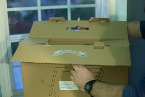
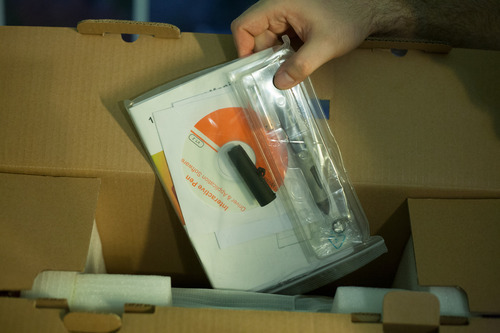
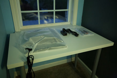


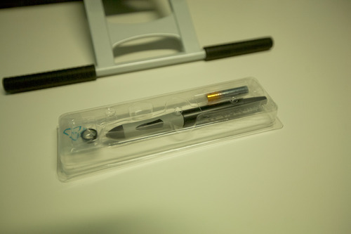

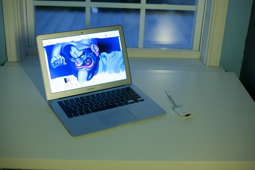
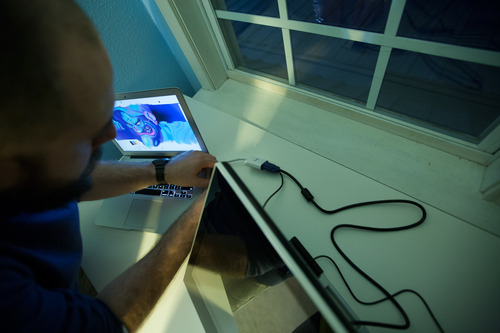
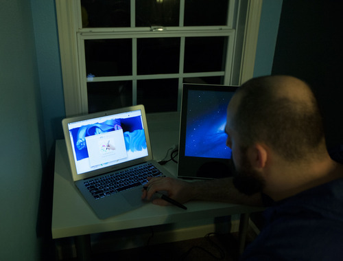
A quick note about drivers. Like with Monoprice tablets, I recommend installing drivers before plugging the tablet in, especially in Windows. Windows will install generic HID (Human Interface Device) drivers otherwise. They’re horrible and you’ll think your tablet is broken. It’s not. You’ll have to uninstall the generic HID driver from device manager, install the proper drivers, and only then plug in your tablet. This mistake accounts for five to ten support emails in my inbox a week.Some stubborn apps enable tablet specific features (like pressure sensitivity options) only after detecting Wacom drivers present on a system. I install Intuos 3 drivers alongside any alternative tablet hardware to fool these apps into thinking a tablet is present. Painter and Illustrator are the two biggest culprits in my experience in both Win and Mac environments.


A note on Paint Tool SAI. I’ve heard there are some issues running a multiple monitor setup with Paint Tool SAI, specifically, but that’s hard to blame on the Yiynova. SAI has been largely abandonware for some time, and it’s starting to show. I recommend using Clip Paint/Manga Studio 5. It’s a bit like a mashup of SAI, Painter, and Photoshop, and has largely replaced all those other apps in my workflow. My Windows box is a single monitor setup, so I was unable to verify these reports.
Digital Technology as a Tool
Process v. Production: What are the distinctive characteristics of digital
media reflected in its language and aesthetic?
• Multiple kinds of manipulation
• Analog v. digital
• Real v. unreal
• Blurring distinctions between different media and seamless combination of
• Recontextualization through appropriation and collage (dada, cubism,
• Relationship between copy and original
INTRODUCTION NOTES 2DFIELD
Screen Space: fixed borders that defines the new aesthetic characteristics
• Aspect ratio: relationship of screen width to screen height
• Horizontal orientation
• Standard ratios
• Standard TV / computer screens adopted 4×3 ratio of early motion
pictures (1.33:1 ratio)
• Digital / HDTV – 16×9 (5.33×3 or 178:1)
• Standard wide screen of motion pictures (5.33×3 or 1.85:1)
• Panavision / Cinemascope has extremely wide aspect ratio – 7×3
(2.35:1)
• Wide-screen – format of most U.S. films
• Framing
• 4×3 frame (film standard was established as early as 1889)
• advantage is that the difference between screen width & height does not emphasize one dimension over another
• works well with close-ups
• 16×9 frame
• have to pay more attention to the peripheral pictorial elements/events
• Changing the Aspect Ratio
• Matching aspect ratio
• Letterboxing: wide screen letterbox is created by showing the whole
width & height of the original format, and masking the top and
bottom of the screen with black, white, or colored bands called
dead zones
• Pillarboxing: fitting a standard 4×3 image onto a 16×9 screen
(vertical pillar bars)
• Cutting, stretching, squeezing
• Secondary Frames
• Masking – blacking out both sides of the screen (ex. D.W. Griffith – Intolerance)
• Multiple screens<<<<<<<<<<<<<<<<<<<<<<<<<<<<<<<<<<
• Moving camera<<<<<<<<<<<<<<<<<<(panning, tilting, arcing, dollying, pedding, trucking)
• Object size > context<<<<<<<<
• Knowledge of object<<<<<<<<<<<<<<<<<<<<<<<<<<<
• Relation to screen area<<<
• Environment & scale<<<<<<<<<<<<<<<<
• Reference to a person<<
• Image size
• Size constancy – we perceive people and their environments as normal sized regardless of screen size
• Image size & relative energy–<<<<
• Power of image is related to screen size & format<<<<<<<<<<<<<<<<<<<<<<<<<<<<
• People & things
Editing Aesthetics
Continuity Style Editing
• Jump Cut: edits that reveal or present themselves as discontinuous jumps in time, action, or space
• Whenever possible vary the horizontal field of view between successive shots. When Shooting events & activities think: wide shot, medium shot, close-up. Your first shot should typically be a master, cover, or
establishing shot, then tighten your shots as you continue to tape.
• TV is a close-up medium. My beginning shooters frame shots too wide and include too much headroom. Always try to capture close-ups of events, but also be conscious of the hazards of shallow depth of field,
framing & composition, and excessive camera shake.
• While varying the horizontal field of view, also attempt to vary the angle of approach.
• Repeating actions, or shooting repetitive actions varying the horizontal field of view and the angle of approach allow you to build matched action edits.
• Let subjects in motion move into and out of stationary frames.
• Shots with secondary movement should begin and end at rest.(panning, tilting, arcing, dollying,
pedding, trucking)
• Classical editing stratregies:
o Eyeline match edits
o Split edits (L & J edits)
o When editing dialogue allow for proper breath space
o Cut in and cut out edits
o Parallel scene edits
o Flash back edits
o Cutting to the beat
o Cutting on dialogue
o Montage
o Dissolve, fade, wipe transitions
o Compositing and collage
SECOND LIFE
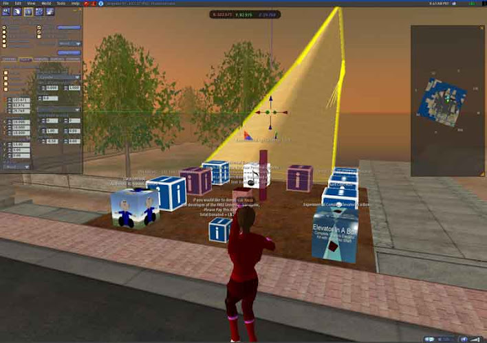
εξ.χωροι/3d
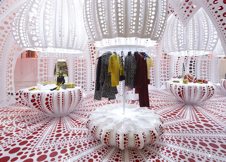
 landscape and arch.


Digital Technology as a Tool
Process v. Production: What are the distinctive characteristics of digital
media reflected in its language and aesthetic?
• Multiple kinds of manipulation
• Analog v. digital
• Real v. unreal
• Blurring distinctions between different media and seamless combination of
• Recontextualization through appropriation and collage (dada, cubism,
• Relationship between copy and original
INTRODUCTION NOTES 2DFIELD
Screen Space: fixed borders that defines the new aesthetic characteristics
• Aspect ratio: relationship of screen width to screen height
• Horizontal orientation
• Standard ratios
• Standard TV / computer screens adopted 4×3 ratio of early motion
pictures (1.33:1 ratio)
• Digital / HDTV – 16×9 (5.33×3 or 178:1)
• Standard wide screen of motion pictures (5.33×3 or 1.85:1)
• Panavision / Cinemascope has extremely wide aspect ratio – 7×3
(2.35:1)
• Wide-screen – format of most U.S. films
• Framing
• 4×3 frame (film standard was established as early as 1889)
• advantage is that the difference between screen width & height does not emphasize one dimension over another
• works well with close-ups
• 16×9 frame
• have to pay more attention to the peripheral pictorial elements/events
• Changing the Aspect Ratio
• Matching aspect ratio
• Letterboxing: wide screen letterbox is created by showing the whole
width & height of the original format, and masking the top and
bottom of the screen with black, white, or colored bands called
dead zones
• Pillarboxing: fitting a standard 4×3 image onto a 16×9 screen
(vertical pillar bars)
• Cutting, stretching, squeezing
• Secondary Frames
• Masking – blacking out both sides of the screen (ex. D.W. Griffith – Intolerance)
• Multiple screens<<<<<<<<<<<<<<<<<<<<<<<<<<<<<<<<<<
• Moving camera<<<<<<<<<<<<<<<<<<(panning, tilting, arcing, dollying, pedding, trucking)
• Object size > context<<<<<<<<
• Knowledge of object<<<<<<<<<<<<<<<<<<<<<<<<<<<
• Relation to screen area<<<
• Environment & scale<<<<<<<<<<<<<<<<
• Reference to a person<<
• Image size
• Size constancy – we perceive people and their environments as normal sized regardless of screen size
• Image size & relative energy–<<<<
• Power of image is related to screen size & format<<<<<<<<<<<<<<<<<<<<<<<<<<<<
• People & things
Editing Aesthetics
Continuity Style Editing
• Jump Cut: edits that reveal or present themselves as discontinuous jumps in time, action, or space
• Whenever possible vary the horizontal field of view between successive shots. When Shooting events & activities think: wide shot, medium shot, close-up. Your first shot should typically be a master, cover, or
establishing shot, then tighten your shots as you continue to tape.
• TV is a close-up medium. My beginning shooters frame shots too wide and include too much headroom. Always try to capture close-ups of events, but also be conscious of the hazards of shallow depth of field,
framing & composition, and excessive camera shake.
• While varying the horizontal field of view, also attempt to vary the angle of approach.
• Repeating actions, or shooting repetitive actions varying the horizontal field of view and the angle of approach allow you to build matched action edits.
• Let subjects in motion move into and out of stationary frames.
• Shots with secondary movement should begin and end at rest.(panning, tilting, arcing, dollying,
pedding, trucking)
• Classical editing stratregies:
o Eyeline match edits
o Split edits (L & J edits)
o When editing dialogue allow for proper breath space
o Cut in and cut out edits
o Parallel scene edits
o Flash back edits
o Cutting to the beat
o Cutting on dialogue
o Montage
o Dissolve, fade, wipe transitions
o Compositing and collage
Η οργάνωση του χώρου εντός του αεροδρομίου έχει συνοπτικά εκτιμηθεί. Αλλά προφανώς, τα πιο ενδιαφέροντα χωρικά χαρακτηριστικά του αεροδρομίου είναι (i) η τοποθεσία του «εκτός του κοινωνικού χώρου» και (ii) η «σχετικοποίηση» των χωρικών συσχετισμών της κοινωνικής ζωής που υποβάλλονται από το ταξίδι.
Ο Augé, σε έναν πολιτισμικό απολογισμό του εναέριου ταξιδιού, επισημαίνει την αβίαστη αποτελεσματικότητα, την μοντερνιστική άνεση και την απρόσωπη διάσταση του συγκεκριμένου μέσου μεταφοράς. Επιπροσθέτως, θα είχεαξία η επισκόπηση των επιπτώσεων του ταξιδιού στο χώρο. Συγγραφείς εθνιστικών κσι μοντερνιστικών θεμάτων και συχνά επισημαίνουν τη σημασία της μόρφωσης, της εκπαίδευσης των μαζών και των χαρτών στη δημιουργία ταυτοτήτων για αόριστες έννοιες όπως το έθνος. Ένα ενδιαφέρον ερώτημα επί αυτού του συσχετισμού είναι το τι είδους ταυτότητα (αν υπάρχει) και ποια αίσθηση χώρου μπορεί να ενθαρρύνουν τακτικά εναέρια ταξίδια. Είναι προφανές και συχνά επισημαίνεται σε τυπικές συζητήσεις πως η ψυχολογική αίσθηση της απόστασης αλλάζει ή διαστρεβλώνεται σημαντικά με τα τακτικά ταξίδια και με την αναδίπλωση(?!) της απόστασης στις ώρεςτης πτήσης.
Powered by WordPress