Selected Courses on Digital Art-UOWM

5 Απριλίου 2013

2DIMREAL-HLWD-POLTCS-STDESIGN01-DAYS OF GLORY

Filed under: Notes — admin @ 17:30

2dim-realism

Photograph of Mordecai Gorelik’s stage design for Charles Bickford’s stage adaptation of Carl Sandburg’s Casey Jones (Source: “A Locomotive Steals the Show: ‘No.4’ Is Hero of Dramatized ‘Casey Jones'” Life (Mar. 14, 1938), p. 41.) 

“The white surface descends and the events of the three dimensional stage imperceptibly blend into two-dimensional illusions.”[1]  And so the German sociologist and film critic Sigfried Kracauer describes that moment just after the orchestra stops playing and right before the projectionist screens a film on the movie screen.  Here, it is as if the lowering of the movie screen saves the audience from the orchestra’s musical assault.   And yet Kracauer’s description of film as “two-dimensional illusions” presents something of a problem.  This is because cinematic set design—a broad term describing the various constructions and decorations used to evoke a film’s concepts and ideas—is also about presenting and conjuring the illusion of three dimensions.  Movies and stage plays both rely and capitalize on the audience’s ability to see things in three-dimensional space.  But the ability to manipulate two-dimensional objects to make them appear as three-dimensional objects is also an important aspect of set design.  This manipulation also had political dimensions.

In a 1947 issue of Hollywood Quarterly, a craft-oriented journal covering the film industry, veteran stage designer Mordecai Gorelik issued a vituperative rant against RKO studio management.  “In some ways the Hollywood treatment of settings cases a revealing sidelight on the general Hollywood approach to reality,” Gorelik writes.[2]   Reminding the reader that a film set is first and foremost a “human environment” and a “highly important, if mute, aspect of the screen story,” Gorelik continues: “What happens to this part of life on its way through the camera lens?  As a Broadway designer who has also worked in pictures (as film production designer), I am bound to report that any attempt to bring reality to movie settings encounters stern resistance on the big lots.”[3]

Concept Drawing by Mordecai Gorelik for None But the Lonely Heart (RKO, 1944) Image: Gorelik (1947)

To prove his point that Hollywood producers did not value realism in set design, Gorelik recounted his experiences as a production designer for several RKO films.  He refers to the the original production designs and art department sketches of street scenes from Clifford Odets’ None but the Lonely Heart (1944) as  “cliché” designs executed by a “Prix de Rome type” who was eventually fired.[4]   Odets would eventually hire Gorelik, who then remade the street scene into a “typical example of rattletrap slum housing.”[5]   This was a shabby aesthetic that Gorelik would perfect for other films as well.  Thus for a British production at Ealing Studios, he designed a dark, squat antique store that called attention to “the pathetic smallness and the sordid poverty of the things on sale.”[6]

Gorelik’s concept sketch for an antique store, Ealing Studios, London. Image: Gorelik (1947)

Gorelik felt that his designs were openly antagonized.  For Jacques Tourneur’s Eastern Front drama, Days of Glory(1944), another RKO production, Gorelik designed a guerilla encampment made to resemble something that impoverished yet redoubtable Red Army cheloveks would mount in anticipation of a Nazi siege.  Gorelik recounts RKO’s set design philosophy at the time:

The RKO method was to do a perfect carpentry job with dressed lumber from the studio stockpile and then chop up the result with axes and chisels in order to denote rude construction […] It was my painful duty to interrupt this process and have the stairway built of logs, saplings, charred timber, old doors, and other material that any reasonable person would consider more available under the conditions of the story.[7] 

Gorelik felt that he was correcting instances of what he labeled “Belasco Naturalism,”[8] a form of “literal reproduction” that amounted to nothing but a “superficial ‘snapshot’ technique without selectivity, style, or dramatic content.”[9]   Gorelik understood that realism could not be achieved “by the literal reproduction of anything”, and thus he advocated a type of documentary quality, an American variant on neorealism’s imprimatur of showing “characters of great humanity caught up in everyday life” in a rich mix of cinematography, writing, and direction that created a cinema based on “the material signs of everyday existence, on the inherent qualities of place, on autobiography, on authentic sentiment.”[10]   This, too, was met with resistance from the studio.  Gorelik continues describing his art director’s heartaches on the set of Days of Glory:

The same picture called for a peasant cart made of crude lumber.  I found just the right material for it on a nearby ranch – rough boards that had lain for years in the open.  The cart was built at the ranch and was brought to the studio.  Next day I saw it in one of the studio alleys.  It had been painted a fine, spanking battleship gray all over; all texture was gone, and you couldn’t tell the wood from the metal parts.  It became necessary to repaint the cart with artificial wood graining in an effort to restore some of its original appearance.[11] 

Such anger and disappointment could perhaps be explained by the fact that Gorelik was one of the foremost stage designers in left-wing and radical theater groups during the 1930s. During that time, New Deal legislation initiated many programs in art stewardship, and theatre groups in American large cities took the initiative and started companies that specialized in the production of “social plays” that responded to the economic, social, and political woes spurred by the Great Depression.  In 1935, Gorelik was a member of the Theatre Union, the most well-known Socialist theater outfit of the era. The Union’s organizers were well-versed in contemporary theater trends, and although they were familiar with a poorly-received 1925 New York production of Bertolt Brecht’s The Threepenny Opera, they did not know much about the playwright’s other dramatic works.  Brecht was disliked among other theatre circles, but he also became famous for his film Kuhle Wampe (1932), a piece of anti-fascist agitprop, and along with Kurt Weill, was identified as part of a new generation of anti-Nazi “revolutionary figures.”  Also, by 1935, the once-maligned production of The Threepenny Operawas beginning to be viewed as a critical success.  Through Friedrich Wolf, director of the Theatre Union, and Benno Schneider, artistic director of the Yiddish left-wing theater group ARTEF, the Union arranged for Brecht’s arrival in the United States.  The two were familiar with Brecht’s most recent play, Die Mutter (The Mother) (1935), the playwright’s ambitious adaptation of the Maxim Gorki novel of the same name, and were busy securing rights and financing to produce the first English-language performance of this play.  Like many other German intellectuals of his generation, Brecht was in exile, seeking solace and protection from the burgeoning rise of Nazism in Germany.  Finally, in 1935, Brecht stole away on a worm-ridden dingy from Denmark to New York.  Upon landing, Brecht immediately contacted Wolf and Schneider, ready to begin work on the American production of The Mother.

Brecht and the Theatre Union did not have an easy relationship.  At first, the production was marred by financial hiccups and major disagreements between Brecht and the show’s producers.  However, the relationship between Brecht and Gorelik was a different matter.  The two became close friends as collaborators.  Gorelik was a devotee of Brecht’s and admired the playwright’s ideas for the set and production design.[12]   When The Mother finally opened on 19 November 1939, the production featured many of the performative elements, such as projection screens, visible lighting apparatuses, and audience-actor participations, commonplace to Brecht’s Lehrstücke, or teaching plays.[13]   There was a small budget for set design for The Mother, but Gorelik nevertheless created a “small revolving stage partitioned through the center” that stood “just under a projection screen.”[14]   Gorelik continues describing his design: “At stage right were two grand pianos.  The stage was illuminated by a row of visible spotlights … The projection screen was in constant use as an editorial commentary.”[15]

Mordecai Gorelik’s stage design for Brecht’s The Mother (1935). Image: Baxandall (1967).

Gorelik’s anti-naturalist sentiments can also be traced to his work with Brecht on The Mother.  Brecht notes that American productions (presumably still under the sway of Belasco’s techniques) utilized a form of naturalism that did not serve the revolutionary potentials of theatre.  Brecht continues:

Naturalism has a revolutionary aspect, for it shows the social conditions which the bourgeois theatre takes great pains to conceal.  Also, a call to fight is sounded, which proves that the fighters exist.  But only in a second phase does proletarian theatre begin, politically and artistically, to qualify itself for it social function.  The first phase shows that the class struggle does exist.  The second shows how it ought to be conducted.[16]

The professional relationship with Brecht was also productive in other ways, for it was during this time that Gorelik was able to formulate his ideas for New Theatres for Old (1940), a book-length exegesis on this history of stage and set design and the first written treatise of the notion of “Epic Theater.”

Epic Theater was a kind of experimental dramatic production that featured “a non-illusory style that was designed to impart an explicit socio-political message through the intentional destruction of theatrical verisimilitude.”[17]   At first, this notion may seem paradoxical, but the main idea behind Epic Theater (as with Brecht’s Lehrstücke) was to break down any type of slavish naturalism, unnecessary photorealism, or—to use Gorelik’s own language—literalism that would impede or dilute the essence, or “scenic gestus” of the production.  On the heels of The Mother, productions like Erwin Piscator’s and Lena Goldschmidt’s The Case of Clyde Griffiths (1936) (a stage adaptation of Theodore Dreiser’s An American Tragedy), Paul Green’s Johnny Johnson (1936), George Sklar’s Life and Death of an American (1939), and Marc Blitzstein’s The Cradle Will Rock (1937), used agitprop elements such as “direct appeals to audiences, choral effects, political slogans, non-illusory setting and staging, episodic structure, type characters”[18]  to deliver a clarified message to the audience.

Gorelik believed that Epic Theatre was the latest and most important event in the evolution of the dramatic arts, a position he vehemently upheld in his New Theatres for Old.  In that book, Gorelik looked to the prehistory of Epic Theatre—Renaissance and Baroque drama—and identified two strains of set and stage design: the conventional and the illusory.  Illusory stage design was in essence a form of symbolism, a form of “attenuated naturalism” that suspended critical judgment and operated under a directive “according to which the environment was reduced to atmosphere, to ‘dreamlike mists,’ [whose] only function of was to create a powerful emotional impression on the beholder.”[19]

Gorelik, on the other hand, characterized Epic Theater as a type of conventional theater.  Finally, here was a type of theatre that “organized experience into a rational structure” whereby each performance was transformed into an “impartial” forum where “facts were introduced, hypotheses were investigated, and fallacies were exposed.”[20]   Epic Theater relied upon the “objective logic of events” by applying principles of scientific Marxism to bring to drama “the experimental, unprejudiced and precise method of the scientific laboratory.”[21]   For Gorelik, the stage presented an opportunity to bring to light “the temporal affairs of the socio-economic world” and to provide “an instrument for the transvaluation of political consciousness … a means of promoting social change.”[22]   Gorelik did believe, however, that the principles of Epic Theater could be applied to the screen as well:

No Epic play or film can hope to present facts which will not be questioned, no matter how well supported the evidence may be.  What is significant is the tendency to rely upon facts, to rely upon the objective logic of events rather than upon subjective emotion.[23] 

But in his 1947 piece for Hollywood Quarterly, Gorelik seems to have made an about-face.  “What of the more subtle use of setting in achieving the style or dramatic content?”[24]  he asks.  Gorelik thus describes another design challenge on the set of None But the Lonely Heart:

For the back alley of the Fun Fair in Lonely Heart the art factory offered a piece of prosaic naturalism, without regard to the fact that this alley was one of the most romantic locales in the story.  Again I was obliged to redesign, curving the walls of the alley, arching it with trees, placing shadowy hoods over doors and windows.  This shift towards a more poetic imagery was meaningless to the art regime.[25] 

Perhaps Gorelik’s invocation of curved forms and manipulated shadows is a veiled reference to Hans Poelzig’s architecture and film set designs.  Yet Gorelik’s fluctuations between realism and “poetic imagery” suggests how this landmark figure was trying desperately to be employed by the “Hollywood Art Machinery” that seemed all too eager to reject him.

This is not to say that global concerns made issues of theatrical realism totally irrelevant.  In 1943, just before Gorelik was working for Odets and Tourneur,  RKO’s “authenticity division” deployed several employees to assist the U.S. Army’s Chemical Warfare Service in building and designing the interiors for the “Typical German and Japanese Test Structures” at Utah’s Dugway Proving Ground.  Acting on information about wood construction techniques and architectural design in Germany and Japan provided by Erich Mendelsohn, Konrad Wachsmann, and Antonin Raymond, the RKO group was only one example of how entertainment and military interests conjoined in service of the war effort.  Gorelik was no exception.  He took up an additional job directing radio plays for the Office of War Information while working as a set designer.  During this time, in 1944, he also began a stint at Douglas Aircraft producing exploded axonometric drawings of airplanes.[26]  And after the war ended, he became a film instructor at a special university for discharged G.I.’s in Biarritz.

Mordecai Gorelik holding a maquette of his stage design for Casey Jones (Source: “A Locomotive Steals the Show: ‘No.4’ Is Hero of Dramatized ‘Casey Jones'” Life (Mar. 14, 1938), p. 42.)

Gorelik was fairly well-known.  So was his struggle against what he would call “Belasco Naturalism.”  Such issues of naturalism versus realism on stage are best encapsulated by a review in Life of Charles Bickford’s 1938 stage adaptation of Casey Jones.  The reviewer describes the centerpiece of the stage design: a giant replica locomotive designed by Gorelik (see image at the very top of this post):

It is made of lath, covered with black velours.  Its fire is a red spotlight.  Its steam is real steam blown by a fan.  Its bell is a sound taken on the New York Central Line.  Its sway is produced by two stagehands operating levers on either end.  Its cost was 81,500.[27]  

Most of the review features images of Gorelik’s stage design.  And in one instance, a small photograph shows the designer himself, holding a small scale model of the “No.4” locomotive, giving the reader a sense of how a three-dimensional object has been flattened to become more of a two-dimensional one.  The review ends with a poignant jab: “Casey Jones, its locomotive aside, is not a good play but it has the makings of a superb movie.”[28]

__________________________

Auras

See and interact with the world in a new way

Thanks to Aurasma, every image, object and even place can have its own Aura. Auras can be as simple as a video and a link to a web page or as complex as a lifelike 3D animation. Use the Aurasma app to unlock Auras and share the experience with friends. Or get experimenting and use the simple tools within the app to create and share your own Auras.


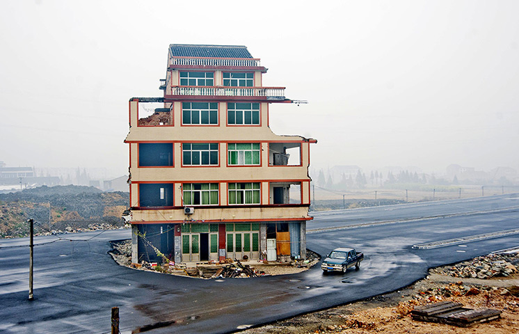
China demolition: A house sits in the middle of a newly built road in Wenling city, China

Wednesday, November 29, 2006

———————————————————————————–

There was a task, however, for which a similar venture into form and structure would prove beneficial. In 1918, the film director Paul Wegener commissioned Poelzig to design the sets for a third film version of Der Golem (The Golem). Poelzig readily accepted the job – their “shared interests in the mysterious and fantastic” undoubtedly “made the collaboration on The Golem easy and fruitful.” As for the 1920 film, it was Wegener’s third version of the Austrian writer Gustav Meyrink’s 1915 novel of the same name. The novel and the film share very little in terms of story line, with Wegner creating an unusual blend of Jewish mysticism and expressionistic élan. Yet the film has a distinct urban flavor – set in the 16th century it tells the tale of the scrupulous and shrewd Rabbi Löw, the most outspoken of Prague’s Jewish community. In response to a premonition that a terrible disaster would befall Prague’s Jewish population (shortly afterwards, local secular authorities would issue an edict to expel and relocate the city’s Jewish population), Rabbi Löw consults his own circle and they decide to build a Golem, an anthropomorphic clay-hewn monster that will protect the people. However, the monster loses control and begins destroying Prague.

Along with this wife, the sculptor Marlene Moeschke, Poelzig designed a whole city for Wegener’s production of The Golem. The director did not want Poelzig to design a typical Medieval village. 

Entrusted with design of “buildings, streets, and interiors which were a formal equivalent of the ideas of mystery and the supernatural which underlie the film,” Poelzig created a three-dimensional space, “a concept foreign to motion pictures up to that time … which forced the camera eye to view it obliquely.”

The finished sets thus have an angular, exaggerated feel, a true architecture of playacting. The only sense of verisimilitude that Poelzig deploys is not architectural – yet there is a sense that these structures convey a sense of psychological and spiritual dread. 

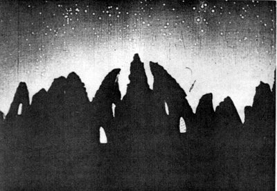
For example, in the opening moments of the film, a group of Rabbinic elders watch the stars, awaiting the fateful premonition that a terrible event will befall Prague’s citizens. On a dark-indigo tint screen, a mysterious constellation of stars hovers above an array of sharp, cragged artichoke-shaped silhouettes. 


There is no way in which a viewer can get a sense of the size or massing of these crags, but in silhouette, they look like a set of broken, upturned teeth.


Poelzig replicates these angular, pointy motifs in his urban set pieces.

 In a long shot of a Prague city scene, steep, crooked, cracked gables retreat into the distance, creating a successive layering of light and shadow that only serves to frame and surround the masses of city dwellers in the middle. 

The triangular shapes are twisted and mangled, inadvertently showing the sections of the individual buildings. 

This layering of light and shadow is more evident in another frame, this one featuring a set of stairs reaching upwards underneath a large, arched bridge. 

A closer inspection reveals a complex interplay of surfaces – whereas in the previous scene the houses reveal a type of plaster and wood-beam construction, here, it looks as if the surfaces were hand-cut from stone. 

The tall, pointed, twisted city gate also combines the elements of light, shadow, and rough surface, creating an undulating structure that spins upward in an angle, coming together at a point that mimics the very same artichoke silhouettes from the night scene. 

Poelzig also uses these elements in set pieces that emphasize landscape. 

In one scene, for example, the Golem follows Rabbi Löw across a serpentine, rocky bridge.

 Far away, beyond the unseen end of the bridge a city’s gnarled and pointed towers and spires rise in the distance.

 On the side of the bridge, a witness to the curving, malevolent shapes unfurling across the landscape, a stone Madonna holds her own child. 

The venerated creator and created, mother and child thus gazes on its tragic analogue: a monster following its inattentive creator into an uncertain future.


The Golem
 can be interpreted as a tragic tale about the relationship between a creator and the maligned offspring created in its image. And this is not insignificant as different variations of this relationship become more and more evident. For example, there is Paul Wegener himself, who played The Golem in all three films. Here, the creator of the film depicts himself as the errant, uncontrollable creation in the movie. Hans Poelzig’s sets for the film are almost an inverse of this relationship. Poelzig’s own errant, maligned “playacting” architectures (such as the “plaster and wire” Schauspielhaus) find a home within the dark, twisted logic of Wegener’s film.


———————————————————————————————————————————————————————————————————————————————————————————————————————————————————————-more info about Hans Poelzig’s arch work———————————————————————————————————————————————————————————————————————————————————————————————————————————————————————————————————————————————————————————————–

continuing the main theme as it is described above and focusing in the relation among the stage and the gaze, the architecture of the recorded space and the interpratation of the image we should consider the work of the arch Hans Poelzig “The Scenographic Poelzig”

Like other expressionist architects of his era, including Bruno Taut and Erich Mendelsohn, Hans Poelzig (1869-1936) is of special interest because of the diversity of his projects. On the one hand, Poelzig’s most famous buildings include his Grosses Schauspielhaus (1919) as well as his competition entry for the Salzburg Festspielhaus (1920-1921). These buildings evoke some of Poelzig’s most famous techniques — a determined massing of organic forms, a full deployment of tonal shadows, as well as a distinct “building from the inside”, a result “of thinking, as it were, of the core of the apple before the skin.”
The Grosses Schauspielhaus deserves some momentary and special analysis as it becomes the alembic through which many of Poelzig’s architectural ideas are distilled and rarified. Specifically, the remarkable contrast between the building’s interior and exterior is worth mentioning. The “Stalactite Grotto”, the Schauspielhaus’ auditorium is perhaps the most-photographed and therefore most well-known part of the building.

——————————————————————————————————————————————————————-speira

From the top of the auditorium, the cupola begins as a small circle. This circle replicates itself, increasing in diameter as it approaches the seating. At each diameter increase, one takes note of a columnar formation, a colonnade (not a stoa) that clings and wraps itself to each level of the cupola. Yet this cladding of “columns” never reaches the next level below. They are perfectly, evenly spaced, but sitting in the auditorium, the interrupted columns give the impression that the cupola is actually comprised of stalactites. The accretion of substances from ages ago does not create these formations, but at least the illusion is there. One could very well think that the building was a cave, a structure formed by the persistent collection of Paleolithic detritus. This conceit continues on to last level, the largest and most outer ring of the cupola, that connects the auditorium seating at a series of supports. These supports, also clad in plaster stalactites, dwindle in size as they meet the ground. As Julius Posener, a student of Poelzig’s, once remarked, “The ‘supports’ do not look convincing.”

And if these figurative stalactite forms envelop the auditorium, the orchestra, as well as the proscenia, then what of the non-performative circulation spaces? A series of brightly-lit foyers with curved ceilings provide apertures to the grotto. Upon exiting (or entering) the auditorium space, one would certainly notice sets of lighted columns. These columns provide a perfect foil to the auditorium supports inside: instead of dead accreted matter, these supports look like lighted fountains. The grooved cladding runs upwards, as the column thickens, and explode in showers of light that literally drip down the curved ceilings and onto the walls. Yet these forms, expressive as they are, do not do justice to Poelzig’s own conceptual sketches. These depict the forms as columns of pure light, sessile supports blooming (or blowing?) up in phalanxes of fire and light.


Yet outside, walking toward the main entrance of the Schauspielhaus … a completely different building. Across the street from this entrance, two neoclassical buildings frame the looming Schauspielhaus in back, for Poelzig’s signature building stands meters above these structures. One may very well sense that the Schauspielhaus is therefore a stage, and moving closer toward that building, one notices its dominant verticality. At grade, an arched Romanesque portico greets opens onto the street. The verticality of the arch supports is replicated in a series of taller, narrower, more numerous arches that stretch upwards, meeting an ever-so-slight gabled form. Yet this gable, and these arches are anything but, for they are more pilaster-like in nature, reliefs lightly hewn into the stereotomic weight of the Schauspielhaus’ façade. This small gabled relief just outwards from another gabled shape restraining a series of arches that are over twice as tall as the smaller arches. And finally, toward the top, this part of the building meets a basilica-like structure running along the spine of the roof axis. And, if for a moment, one were to step back to the point of this perambulation, to that point where the neoclassical structures frame the stage that is the Schauspielhaus’ facades, one could very well be overwhelmed by the successive layering of arched elements – a seemingly-infinite regression of vertical lines extending beyond, and reaching upward.


These inconsistencies – a distinct organic métier in the auditorium, a decidedly classicist formal gesture for the facades – can be linked to Poelzig’s own education. Under the tutelage of Karl Schäfer, Poelzig developed an intense fascination for the structural elements of Renaissance and Gothic architecture. Although his contact with these styles came through the writings of Viollet-le-Duc and Ungewitter, Poelzig cultivated an unusual understanding of the relationship between form and structure.


Poelzig articulated this relationship in a 1906 speech made in Dresden
 at The Third German Exhibition of Applied Art
 (Die Dritte Deutsche Kunstgewerbe-Austellung). 

At that time, Poelzig compared the use of historical cladding (and other historicist elements in architecture) as fermentation. This complex metaphor thus described a situation where an architect would use a historical reference without understanding the cultural genesis of that reference – a process comparable to drinking wine whose age had yet to be appreciated (i.e. unfermented wine). The term also described an era – like the one Poelzig worked in – where historic references were in a process of figurative fermentation.

Again, the issue of cladding held a particular place in Poelzig’s imagination. The indiscriminate and uninformed articulation of surfaces incensed the architect. In 1906, Poelzig thus declared that “a true architecture is not to be achieved with the armoury of decoration, that the problems of modern architecture cannot be mastered by purely external means.

” Use of historical (or contemporary) reference for cladding must take into consideration the structural possibilities of glass and steel. A “tectonic solution” must therefore avoid a situation where ” supports remain shapeless and receive merely surface decoration.
(?proimio LeCourb)


” Poelzig continues:

We also forget that the utilization of structures from earlier times for a building designed to meet the demands of modern life must be accompanies by an unmistakably modern adaptation of these structures, and that the correct use of materials and construction consciously adapted to purpose produce inner advantages that cannot be replaced by decorative embellishments, however skillfully applied.

However, some critics did not agree that Poelzig put his principles to practice. In 1920, 

art critic Karl Scheffler (who recommended to Max Reinhardt that Poelzig be hired to design the Schauspielhaus), wrote:

… for here everything from the first to the last is sham. This colossal, solid looking … building is a glittering stage set, a complicated, artistic, architectural mask of plasterboard. All the elements that seem to be growing, to carry, to support and vault are actually being carried, supported, vaulted. The entire mass of the building is suspended on the old iron frame. The whole thing is a web of wire with plaster thrown on it. The plaster has been modeled and then painted with bold colors. Here even the architecture is playacting. This kind of architecture, thrown up like this, has nothing to do with craftsmanship in the good old-fashioned sense of the word.

*

Δεν υπάρχουν Σχόλια

No comments yet.

RSS feed for comments on this post.

Sorry, the comment form is closed at this time.

Powered by WordPress

error: Content is protected !!