Selected Courses on Digital Art-UOWM

21 Ιανουαρίου 2013

Filed under: Notes — admin @ 15:46


  • Ask the pupils to make a sequence of drawings based on one particular image to show how it might be adapted and developed to convey the idea of change over time or to communicate the idea of movement.


  • Ask them to develop their series of drawings using line and colour to convey a particular mood, emotion or feeling. Encourage pupils to work on a variety of scales and seek out unusual interpretations.


Filed under: Notes — admin @ 15:45

Introduce the unit by discussing images that represent a variety of moods, emotions or feelings, eg panic, happiness, anger, anxiety. Ask the pupils to analyse and comment on the visual qualities of these images and to highlight key features, 

eg gesture, harmony, movement, framing. 


Ask them what they think and feel about these images

Filed under: Notes — admin @ 15:36

http://webarchive.nationalarchives.gov.uk/20061104184552/http://www.tate.org.uk/modern/exhibitions/juanmunoz/rooms/default.shtm

Section 1: Exploring and developing ideas 

  • Introduce the unit by discussing images that represent a variety of moods, emotions or feelings, eg panic, happiness, anger, anxiety. Ask the pupils to analyse and comment on the visual qualities of these images and to highlight key features, eg gesture, harmony, movement, framing. Ask them what they think and feel about these images.

View related objectives and outcomes

Section 2: Exploring and developing ideas (2) 

  • Show examples of abstract and expressionist painting. Ask the pupils to identify or interpret in each case:
    • the visual qualities of the work
    • the way that the artist has used visual qualities and techniques
    • the impact on the viewer
  • Show the pupils further examples of particular movements or styles of art, eg surrealism, fauvism, futurism, pop art. Ask them to work in pairs to analyse and comment on the examples. Ask them to identify in each case two or three key features of the work and say what kind of idea, mood or feeling is communicated by the artist and to produce a piece of writing from this.

View related objectives and outcomes

Section 3: Exploring and developing ideas (3) 

  • Ask pupils to work individually, in pairs or in groups to research in depth one particular style or movement in art. Ask them to select images and other visual reference material and store them in a sketchbook, on videotape, photographically or in electronic form.
  • Ask the pupils to make a visual analysis of one or more examples and annotate this, identifying the key features and characteristics of the work. Ask them to identify the images that are most effective in communicating ideas, considering the impact of composition and use of media.
  • Encourage the pupils to discuss and develop their ideas with each other and with you.

View related objectives and outcomes

Section 4: Exploring and developing ideas (4) 

  • Ask the pupils to make a sequence of drawings based on one particular image to show how it might be adapted and developed to convey the idea of change over time or to communicate the idea of movement.
  • Ask them to develop their series of drawings using line and colour to convey a particular mood, emotion or feeling. Encourage pupils to work on a variety of scales and seek out unusual interpretations.

View related objectives and outcomes

Section 5: Investigating and making (1) 

  • Ask the pupils to work in groups to create a moving image, using digital video and editing practices. Ask each group to discuss the images they have produced so far and choose one to develop into a moving image.
  • Ask the groups to consider who the work is for and why it will be produced, eg to explain the work of art to a young child, to advertise a product.
  • Discuss the moral and social issues related to basing their work on the work of another, eg copyright, ownership, the implications of manipulating work produced by someone else.

View related objectives and outcomes

Section 6: Investigating and making (2) 

  • Demonstrate the use of tools and processes and ask pupils to explore these, eg:
    • building a simple optical toy with drawn moving images
    • drawing on 16mm clear leader film with permanent marker pens, and projecting this to produce a moving image
    • building simple models in modelling dough and animating them, using 8mm film cameras or video cameras
    • combining drawn and painted images digitally to produce composite images, and using image manipulation packages to produce simple animations
    • using video and film to produce short sequences of moving images that convey an emotion to the viewer
  • Ask pupils to agree how they will develop the image, the techniques they will use, who will do what and how they will achieve the end result. Ask them to use moving image techniques and combine these with soundtracks.

View related objectives and outcomes

Section 7: Evaluating and developing work (1) 

  • Discuss the outcomes of pupils’ work. Consider what impact the use of film, moving images and new technology has had on the work.
  • As part of the evaluation process, ask the pupils to look at the saved images from the developmental work to see how far their work reflects their original intentions.

View related objectives and outcomes

Section 8: Evaluating and developing work (2) 

  • Ask the pupils to analyse how visual qualities have been used in their own and others’ work and how these reflect their intentions.
  • Use the evaluation to make changes to their work.

View related objectives and outcomes


Sections in this unit

This unit is divided into sections. Each section contains a sequence of activities with related objectives and outcomes. You can view this unit by moving through the sections or print/download the whole unit.
1. Exploring and developing ideas
2. Exploring and developing ideas (2)
3. Exploring and developing ideas (3)
4. Exploring and developing ideas (4)
5. Investigating and making (1)
6. Investigating and making (2)
7. Evaluating and developing work (1)
8. Evaluating and developing work (2)

πειραματισμοί!

Filed under: ΕΡΓΑΣΙΕΣ-PROJECTS — admin @ 15:16

Filed under: houses — admin @ 12:58

1. επιλογή κτιρίου

2. σημείωση στο χάρτη της θέσης
3. καταγραφή υλικού – σίγουρα όχι μόνο φωτογραφίες αλλά περισσότερο και  άλλα στοιχεία() για να αποκτήσει 
ΚΤΙΡΙΟ —   ΌΠΟΙΑ ΟΝΟΜΑΣΙΑ ΕΠΙΛΕΞΕΤΕ ΝΑ ΤΟΥ  ΔΩΣΕΤΕ () η εχει—–ΟΔΟΣ_/ΑΡΙΘΜΟΣ 
και ΌΤΙ ΥΠΑΡΧΕΙ ΑΠΟ 
ΠΕΡΙΓΡΑΦΗ  περιγραφή/ΣΧΕΔΙΑ- σειρά από σχέδια/ΙΣΤΟΡΙΚΟ/ΚΑΤΟΨΗ/ ΦΩΤΟΓΡΑΦΙΕΣ/ΦΩΤΟΓΡΑΦΙΑ/ΠΡΟΟΠΤΙΚΟ/3D

2dfield

Filed under: Notes — admin @ 05:53

The 2D Field: Area

Screen Space: fixed borders that defines the new aesthetic characteristics
• Aspect ratio: relationship of screen width to screen height
• Horizontal orientation
• Standard ratios
• Standard TV / computer screens adopted 4×3 ratio of early motion
pictures (1.33:1 ratio)
• Digital / HDTV – 16×9 (5.33×3 or 178:1)
• Standard wide screen of motion pictures (5.33×3 or 1.85:1)
• Panavision / Cinemascope has extremely wide aspect ratio – 7×3
(2.35:1)
• Wide-screen – format of most U.S. films
• Framing
• 4×3 frame (film standard was established as early as 1889)
• advantage is that the difference between screen width & height
does not emphasize one dimension over another
• works well with close-ups
• 16×9 frame
• have to pay more attention to the peripheral pictorial
elements/events
• Changing the Aspect Ratio
• Matching aspect ratio
• Letterboxing: wide screen letterbox is created by showing the whole
width & height of the original format, and masking the top and
bottom of the screen with black, white, or colored bands called
dead zones
• Pillarboxing: fitting a standard 4×3 image onto a 16×9 screen
(vertical pillar bars)
• Cutting, stretching, squeezing
• Secondary Frames
• Masking – blacking out both sides of the screen (ex. D.W. Griffith –
Intolerance)
• Multiple screens
• Moving camera
• Object size > context
• Knowledge of object
• Relation to screen area
• Environment & scale
• Reference to a person
• Image size
• Size constancy – we perceive people and their environments as
normal sized regardless of screen size
• Image size & relative energy
• Power of image is related to screen size & format
• People & things

 The 2D Field: Forces within the Screen

Main directions
• Horizontal (ex. Renaissance architecture)
• Vertical (ex. Gothic Cathedrals)
• Horizontal/Vertical combination
• Tilting the horizontal plane
• Level horizon: stability
• Tilted horizon: dynamism
• Tilted horizon: stress
Magnetism of the Frame
• Top edge (ex. Headroom)
• Sides (ex. Positive /negative pull)
• Corners
• Centered object: even pull (ex. pull of entire frame)
• Large disc: expansion (ex. attraction of mass)
• Small disc: compression
Asymmetry of the Frame
• Up/Down diagonals
• Screen left/right asymmetry
• Tend to pay more attention to the right side than the left
• Figure & Ground
• Characteristics
• Figure is “thing like” – you perceive it as an object
• The line that separates the figure from the ground belongs to the
figure not the ground
• The figure is less stable than the ground
• The ground seems to continue behind the figure
• Superimposition – ambiguous figure/ground relationship
• Figure/Ground reversal
Psychological Closure: tendency to mentally fill in gaps in visual information to
arrive at complete & easily manageable patterns & configurations
• Gestalt – pattern that results from applying psychological closure (whole that
is larger than the psychological sum of its parts)
• Example 3 notes played together become a chord
• High & Low definition images: high definition images has more information
than a low definition image
• High – HDTV/film
• Low – standard TV
• Requires constant psychological closure
• Facilitating Closure – low definition image is helpful only if it facilitates,
rather than inhibits, closure
• Proximity – when similar elements lie in close proximity to one
another we tend to see them together
• Similarity – similar shapes are seen together
• Continuity – once a dominant line is established its direction is not
easily disturbed by other lines cutting across it
Vectors – directional forces that lend our eyes from one point to another (force
with direction & magnitude)
• Vector Field – combination of vectors operating within a single picture field;
picture field to picture field; picture sequence to picture sequence; screen to
screen; on screen to off screen events
• Vector Types
• Graphic Vector – stationary element that guides our eyes in a certain
direction
• Ambiguous direction
• Index Vector – points in a specific direction
• Vector Magnitude – determined by screen direction, graphic mass, perceived
object speed
• Z-axis vector: points toward or away from the camera
• The larger the graphic mass in motion, the higher its vector magnitude
• The faster the speed of an object the higher its vector magnitude
• Vector Directions
• Continuing Vectors – point in the same direction
• Converging Vectors – point toward each other
• Diverging Vectors – point away from each other
Chapter 8 – Structuring the 2D Field: Interplay of Screen Forces
Stabilizing the Field Through Distribution of Graphic Mass & Magnetic Force
• Graphic Weight
• Dimension
• Shape
• Orientation
• Location
• Color
• Hue
• Saturation
• Brightness
• Screen Center – most stable position of an object
• Off Center – the more the object moves off center the greater its
graphic weight and the attraction of the frame increases
• Counter weighting – achieve balance with another object of similar graphic weight

Stabilizing the Field Through Distribution of Vectors
• Structural Force of Index Vectors
• Nose room & Lead room – need to leave enough room otherwise it will feel cramped
• Nose room for index vectors
• Lead room for motion vectors
• Converging Vectors – can balance an index vector with a converging one within the same screen
• Graphic Vectors – can use mass to contain other graphic vectors Stages of Balance
• Stabile Balance – symmetrical structuring of visual elements
• Neutral Balance – graphic elements are asymmetrically distributed
• Golden Section – division of the screen into roughly 3×5 units
• Rule of Thirds – divide screen into 3 horizontal and 3 vertical fields
• Modular Units – adapted golden section proportions into a modular concept
• Labile Balance – distribution of graphic weight, frame magnetism, and vectors are pushed to their structural limit, creating a tendency for imbalance (high tension)

Object Framing
• Facilitating closure – organize structures into easily recognizable patterns
• Graphic Cues – facilitate psychological closure by arranging the vector field within the screen area so that all the vectors extend easily beyond the screen into the off screen space
• Premature Closure – improper framing can lead to early psychological closure
• Natural Dividing Lines –premature closure when framing at natural dividing lines
• Illogical Closure – tendency to group objects together into patterns regardless
of whether they belong together

The Aesthetic Edge Unusual Compositions – breaking compositional rules for emphasis
• Emphasis through off-center placement
• Emphasis through partial onscreen placement

Multiple Screens
• Increased information

Dividing the Screen: screens within a screen
• Graphic Blocks
• Secondary Screen
• 2-axis vectors in split screen
• Temporal & spatial contexts
• Temporal – when several simultaneous events are shown in separate, isolated secondary screens, the direction of the index & motion vectors within such screen is relatively unimportant
• Spatial – placement of screens in the primary screen space, and the direction of the index & motion vectors with a secondary frame become significant structural considerations

20 Ιανουαρίου 2013

Filed under: HARDWARE — admin @ 17:13
Cintiq Alternative

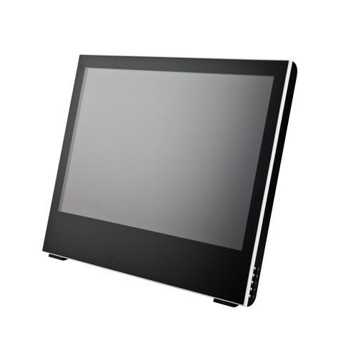
The Yiynova MSP19U Cintiq Alternative Swings for the Fences

With the release of their second generation budget Cintiq alternative, Yiynova gets it right

Yiynova took on Wacom’s tablet display monopoly last year with their release of the DP10 and MSP19. I reviewed those units and they left me wanting.
The Yiynova used Waltop digitizers (digitizers being the bit of hardware that senses stylus position and pressure variance). There was significant jitter in the line quality. Creating straight lines was near impossible especially when making a deliberate, slow effort and the cursor jumped around like a ferret on meth. The display quality and fit and finish were fine, but the underlying tablet tech was a let down. My conclusion? The Waltop digitizer was junk and it let the otherwise competent hardware hanging.
After, I reviewed Monoprice’s graphics tablets. Those use UC Logic digitizers. They’re snappier in OSX than Wacom equivalents with less cursor lag and crisper fidelity in small movements. They sensed light pressure with more accuracy than any Wacom hardware I’ve owned. I was so pleased with the UC Logic based tablets that I purchased a heap of other equipment by them. I sold my Cintiq. I sold my Intuos. Eight months, four tablets and around nine styli later, I became an all UC Logic studio.
I wished that someone could pair the underlying, fantastic UC Logic digitizer tech with a tablet monitor enclosure. I even bought some hardware to try and make my own. But now I don’t have to. Yiynova must have been listening. The MSP19U is a second generation product that jettisons the inferior Waltop digitizers of the first model and replaces them with UC Logic internals.
Does the pairing live up to the sum potential of its disparate parts? Can a relatively unknown $569 tablet monitor compete with a $1999 Wacom Cintiq? Yes, it competes. It even bests the Cintiq in a few key areas. But I’m jumping ahead.

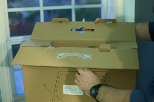
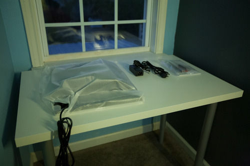
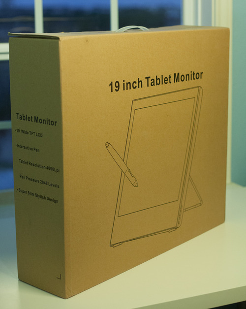
Unboxing, Specs, and the Physical Properties of the Unit

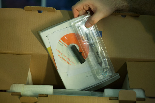
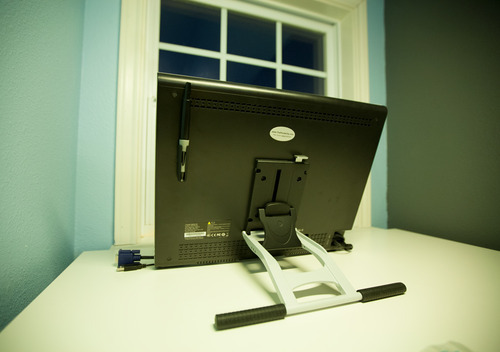
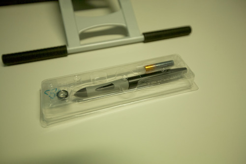
The Yiynova MSP19U is a 19,” 1440×900 tablet monitor with an adjustable, VESA-compatible stand and mounting bracket. It comes with one stylus, one battery, and several additional pen nibs. It has 2048 levels of pressure sensitivity and a 4000lpi digitizer.
The unit is light but not flimsy. Thinner than a Cintiq thanks to its LED backlighting, I find myself occasionally sitting the Yiynova in my lap like a digital art board.
At 19,” 1440×900, and 89.37 PPI, no one will mistake the Yiynova for a retina level display. It’s nearest Wacom neighbor, the 22HD, has a 22,” 1920×1080, and 100.13 PPI, screen. While the Wacom beats the Yiynova in sheer PPI, I always found the color of Cintiqs to be quite muddy thanks in part to an antiglare coating present on the monitors and dim backlighting. I went so far as to remove the glass from my Cintiq to scrape the coating off its back. It helped a little, but was still less than ideal and was not an activity for the faint of heart. Prying, scraping, and modding a $2,499 device to make it useable is a bummer and I went into a lot of detail about the shortcomings of Cintiq tech in my previous review if you want to learn more.
The LED backlighting on the Yiynova makes for a brighter overall display. It’s a little cool out of the box, but was fine once calibrated. If I had to choose between lower PPI or dimmer, muddier colors, I’d pick slightly lower PPI. This particular category is probably a draw.
The glass of the display sits above the LCD by around an 1/8th of an inch and looks to be about the same distance as my previous Cintiq. Until a manufacturer creates a unit with an iPad-like fused LCD and glass display, cursor parallax will be a concern (and is present for both the MSP19U and Cintiqs).
The stand allows for either complete verticality or nearly horizontal viewing angles and is easy to operate. Rotation is not possible, but I find it to be less of a necessity these days. Photoshop, Painter, Manga Studio, and nearly any art app worth it’s salt allow users to rotate the canvas arbitrarily.
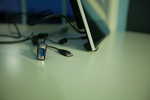
There’s a VGA out port on the back of the monitor that will mirror the activity on your tablet to yet another external display. It’s an odd inclusion, but could be handy for making presentations or when teaching a digital art class. I do both from time to time, so it may be of some use.

Software & Hardware Installation

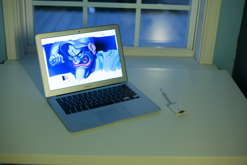
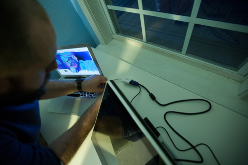
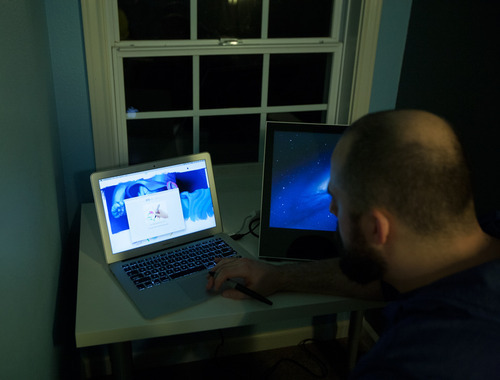
Setup was quick. I tested the unit on maxed 2012, 13” Macbook Air. The Air has a mini display/thunderbolt port, so an adapter was required to pair it with the Yiynova. All in, the MSP19U needs a VGA port, a wall socket, and a USB port to get rolling.
I already had UC Logic drivers installed on my system from my Monoprice tablets, so I only had to plug in the tablet to begin. The bundled driver software is the same version as the downloadable driver on the UC Logic, Panda City, and Yiynova websites, so use whatever is most convenient.
A quick note about drivers. Like with Monoprice tablets, I recommend installing drivers before plugging the tablet in, especially in Windows. Windows will install generic HID (Human Interface Device) drivers otherwise. They’re horrible and you’ll think your tablet is broken. It’s not. You’ll have to uninstall the generic HID driver from device manager, install the proper drivers, and only then plug in your tablet. This mistake accounts for five to ten support emails in my inbox a week.
Some stubborn apps enable tablet specific features (like pressure sensitivity options) only after detecting Wacom drivers present on a system. I install Intuos 3 drivers alongside any alternative tablet hardware to fool these apps into thinking a tablet is present. Painter and Illustrator are the two biggest culprits in my experience in both Win and Mac environments.

Does it work?

I tested the monitor with Photoshop CS6, Painter 12, and Manga Studio 4 and 5 in OSX and Windows. Much like the Monoprice tablets that came before, I found performance even better in OSX than Windows, but fine in both.
There are cursor calibration options in Windows, but no such options in OSX. I didn’t find cursor offset or parallax to be as bad on the Yiynova as on a Cintiq, and never found myself wanting or needing to futz with the cursor offset anyhow.
Cursor lag is similarly less pronounced on the Yiynova than a Cintiq and drawing felt more natural as a result.

A note on Paint Tool SAI. I’ve heard there are some issues running a multiple monitor setup with Paint Tool SAI, specifically, but that’s hard to blame on the Yiynova. SAI has been largely abandonware for some time, and it’s starting to show. I recommend using Clip Paint/Manga Studio 5. It’s a bit like a mashup of SAI, Painter, and Photoshop, and has largely replaced all those other apps in my workflow. My Windows box is a single monitor setup, so I was unable to verify these reports.

The drawing surface is slicker than that of a Cintiq and took a little getting used to. I found that long, deliberate lines could sometimes wobble a bit as my stylus tip slid on the glass, but it was a user limitation, not a failure of the digitizer panel.
Viewing angles on the monitor are worse than a Cintiq, but brightness is better. Viewing angles never veered into unusable territory, but the resolution and viewing angles of the LCD are the single largest area I’d like to see improved in the future.
Bottom line? Is it perfect? No. Are Cintiqs? No.
The Cintiq 22HD costs $1999. It has a slightly laggier feel to drawing, but a higher resolution display and has programmable hotkeys. It’s heavy and cumbersome. At the time of writing, the Yiynova MSP19U costs $569. It has a superior drawing experience in terms of lag and cursor offset to my eye, but a lower quality display and no hotkeys. It’s light and easier to move around a desk or sit in your lap.
Even without the price disparity, I would opt for the MSP19U. Cursor lag was the single biggest complaint I could muster against the Cintiqs and I think the 19U is the winner there. How well it draws trumps how good the image looks for me every time.
But, price matters and we should talk about it. The 19U costs 72% less than the Cintiq 22HD and 77% less than the 24HD. Even if it were marginally worse in all regards – and I find it neither heads and shoulders above or below, simply different – it would still be a steal.
My 19U is now a permanent member of the household. I don’t plan on, or feel the need to, replace it with a Cintiq.
Wacom has genuine competition on both the tablet and tablet monitor fronts. Spread the word. Make them feel some heat. There’s no reason this technology should be so expensive. The underlying hardware has been largely stagnant for a decade with no real innovation.
At $569, and with performance that often meets or exceeds Wacom’s hardware, the MSP19U is more than a viable alternative. It’s the disruptive agent of change the industry needs.
19 Ιανουαρίου 2013

Filed under: Notes — admin @ 22:11

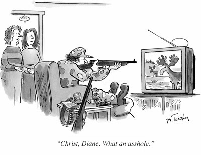
Christ, what an asshole” seems a fitting caption for nearly every New Yorker cartoon, and yet it’s only been submitted 27 times out of well over 1.5 million entries in the magazine’s caption contest. We’ve found one place the Internet’s trolls haven’t managed to permeate.
The “CWAA” revelation dates all the way back to February 2006, from a blog post by Charles LaVoie at modernarthur.com entitled “How ‘Christ, What An Asshole!” is the Answer to the New Yorker Magazine Caption Contest” (the blog is no longer maintained, but the page is viewable via the Wayback Machine). LaVoie displays several example caption contest cartoons demonstrating the broad applicability of the phrase to near every New Yorkercartoon.
The blog entry was discovered by reddit just over 4 years later, with the most prominent entry stating “Every New Yorker cartoon can be captioned with ‘Christ, what an asshole!’ without reducing its comedy value.” Another blog, robertsinclair.net, noted that the phrase also works in the last panel of “virtually all comics, old and new.” “CWAA” remains a popular caption across artistic disciplines on the Internet.
Ars inquired at the New Yorker (a sister publication of Ars) to see how many times the phrase has actually been submitted as an entry in the caption contest. “A total of 27 times for the first 332 contests, and there were 23 contests in which it occurred,” said Bob Mankoff, cartoon editor at theNew Yorker—a mercifully low number, for a contest with a Web submission form. Mankoff noted that the average number of submissions for each contest is over 5,000, so there is remarkably little “CWAA” noise.
There are many meta-humor takes on New Yorker caption contest cartoons, said Mankoff. This includes “What a misunderstanding!,” from a blog maintained by Cory Arcangel, which Mankoff said probably fits more contests than “CWAA.” Others are “mashups with Kanye West tweetsCharlie Sheen rants, and Rick Santorum’s political pontifications,” said Mankoff. “We take no umbrage at any of these, although we don’t think that meta is necessarily beta.” We’re glad to see the Internet can goof around without making Mankoff’s job any harder.

archieves arch

Filed under: Notes — admin @ 21:55
http://archiveofaffinities.tumblr.com/archive

http://www.moma.org/explore/inside_out/category/1913-centennial-celebration

katefthinsi

Filed under: Notes — admin @ 17:42


 Digital Technology as a Tool
Process v. Production: What are the distinctive characteristics of digital
media reflected in its language and aesthetic?
• Multiple kinds of manipulation
• Analog v. digital
• Real v. unreal
• Blurring distinctions between different media and seamless combination of 

art forms

• Recontextualization through appropriation and collage (dada, cubism, 

surrealism)

• Relationship between copy and original


INTRODUCTION NOTES 2DFIELD

Screen Space: fixed borders that defines the new aesthetic characteristics
• Aspect ratio: relationship of screen width to screen height
• Horizontal orientation
• Standard ratios
• Standard TV / computer screens adopted 4×3 ratio of early motion
pictures (1.33:1 ratio)
• Digital / HDTV – 16×9 (5.33×3 or 178:1)
• Standard wide screen of motion pictures (5.33×3 or 1.85:1)
• Panavision / Cinemascope has extremely wide aspect ratio – 7×3
(2.35:1)
• Wide-screen – format of most U.S. films
• Framing
• 4×3 frame (film standard was established as early as 1889)
• advantage is that the difference between screen width & height does not emphasize one dimension over another
• works well with close-ups
• 16×9 frame
• have to pay more attention to the peripheral pictorial elements/events
• Changing the Aspect Ratio
• Matching aspect ratio
• Letterboxing: wide screen letterbox is created by showing the whole
width & height of the original format, and masking the top and
bottom of the screen with black, white, or colored bands called
dead zones
• Pillarboxing: fitting a standard 4×3 image onto a 16×9 screen
(vertical pillar bars)
• Cutting, stretching, squeezing
• Secondary Frames
• Masking – blacking out both sides of the screen (ex. D.W. Griffith – Intolerance)
• Multiple screens<<<<<<<<<<<<<<<<<<<<<<<<<<<<<<<<<<
• Moving camera<<<<<<<<<<<<<<<<<<(panning, tilting, arcing, dollying, pedding, trucking)
• Object size > context<<<<<<<<
• Knowledge of object<<<<<<<<<<<<<<<<<<<<<<<<<<<
• Relation to screen area<<<
• Environment & scale<<<<<<<<<<<<<<<<
• Reference to a person<<
• Image size
• Size constancy – we perceive people and their environments as normal sized regardless of screen size
• Image size & relative energy–<<<<
• Power of image is related to screen size & format<<<<<<<<<<<<<<<<<<<<<<<<<<<<
• People & things

Editing Aesthetics

Continuity Style Editing
• Jump Cut: edits that reveal or present themselves as discontinuous jumps in time, action, or space
• Whenever possible vary the horizontal field of view between successive shots. When Shooting events & activities think: wide shot, medium shot, close-up. Your first shot should typically be a master, cover, or
establishing shot, then tighten your shots as you continue to tape.
• TV is a close-up medium. My beginning shooters frame shots too wide and include too much headroom. Always try to capture close-ups of events, but also be conscious of the hazards of shallow depth of field,
framing & composition, and excessive camera shake.
• While varying the horizontal field of view, also attempt to vary the angle of approach.
• Repeating actions, or shooting repetitive actions varying the horizontal field of view and the angle of approach allow you to build matched action edits.
• Let subjects in motion move into and out of stationary frames.
• Shots with secondary movement  should begin and end at rest.(panning, tilting, arcing, dollying,
pedding, trucking)

• Classical editing stratregies:

o Eyeline match edits
o Split edits (L & J edits)
o When editing dialogue allow for proper breath space
o Cut in and cut out edits
o Parallel scene edits
o Flash back edits
o Cutting to the beat
o Cutting on dialogue
o Montage
o Dissolve, fade, wipe transitions
o Compositing and collage

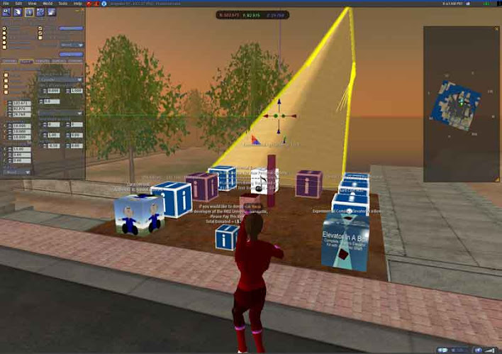
SECOND LIFE

Photo

εξ.χωροι/3d
huaxi-city-centre-by-mad-and-others-mad_03.jpglandscape and  arch.huaxi-city-centre-by-mad-and-others-huaxi-urban-nature_north-5.jpg

huaxi-city-centre-by-mad-and-others-big_01.jpg

huaxi-city-centre-by-mad-and-others-atelier_manferdini_03.jpg

« Newer PostsOlder Posts »

Powered by WordPress

error: Content is protected !!